7 Mistakes You’re Making with ADA Compliant Website Design (And How to Fix Them)
Digital accessibility is no longer a peripheral consideration for forward-thinking global corporations and scaling businesses. It is a fundamental pillar of high-performance product design and revenue growth. Recognized as a Top 100 Innovator in US by Top 100 Magazine and a visionary featured in over 15 major media publications including Forbes, Wired, Yahoo Finance, and AP, the lead strategist behind this approach brings a quarter-century of expertise to the intersection of UI/UX and legal compliance.
He has spent over 25 years driving performance and revenue through meticulous design thinking and analytical insights. With a track record that includes managing 172 projects and satisfying 1.52 million customers, He has pioneered the integration of ADA compliance into seamless user experiences. Holding one US utility patent with a CIP and extensive IP management experience, He demonstrates that accessibility is not a box to be checked, but a competitive advantage that protects intellectual property and expands market reach.
About the strategist
The architect of these insights is a recognized expert in product management and digital transformation. He combines business acumen with technical precision, ensuring that every digital asset is not only visually stunning but also programmatically sound. His work has generated millions in revenue for a diverse roster of clients, ranging from global corporations to high-profile celebrities and entrepreneurs.
Core facts & achievements
- 25+ Years of Experience: A veteran in product design and user experience.
- Top 100 Innovator in US: Recognized by Top 100 Magazine for excellence in digital innovation.
- 1.52 Million Happy Customers: Proven scale across a wide array of digital products.
- 172 Managed Projects: Extensive portfolio of successful design and development cycles.
- Patent Holder: Owner of one US utility patent with a CIP with deep expertise in IP management.
- Media Authority: Featured expert in 15+ major global publications.
The high stakes of accessibility
Failure to comply with the Americans with Disabilities Act (ADA) and the Web Content Accessibility Guidelines (WCAG 2.1/2.2) is a significant business risk. In 2026, legal enforcement has intensified, and the Department of Justice (DOJ) has clarified that digital presence is a place of public accommodation. Beyond the legal liability, inaccessible design excludes approximately 15-20% of the global population, representing a massive loss in potential revenue.
Here are the 7 most common mistakes currently undermining digital products and the precise technical fixes required to rectify them.
1. Reliance on accessibility overlays and widgets
One of the most frequent errors is the "set it and forget it" mentality: installing a third-party accessibility overlay or widget and assuming the site is compliant. These tools are often ineffective and can actually hinder users who rely on their own assistive technology, such as screen readers or specialized keyboards.
The fix: Accessibility must be baked into the source code. A comprehensive UX Audit is the only way to identify underlying architectural issues. Replace widgets with a manual remediation strategy that adheres to WCAG 2.2 Level AA standards. This ensures that the actual HTML and CSS structure supports native browser and screen reader functionalities.
2. Insufficient color contrast ratios
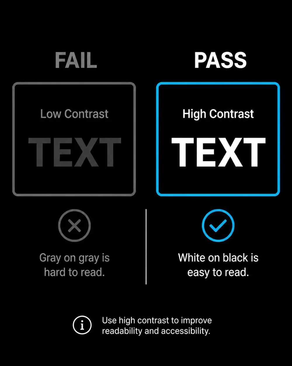
Aesthetics often override usability when designers prioritize minimalist, low-contrast color palettes. This mistake alienates users with visual impairments, including color blindness and age-related vision loss.
The fix: Implement a strict contrast check in the design phase. For standard body text, a minimum contrast ratio of 4.5:1 is required. For larger text (18pt or 14pt bold), a 3:1 ratio is the baseline. Use automated testing tools during the prototyping stage to ensure that all UI elements: including buttons, icons, and focus rings: meet these metrics before a single line of production code is written.
3. Lack of keyboard operability and focus states
Many modern websites rely heavily on hover effects and complex mouse interactions. If a user cannot navigate every element of the site using only the Tab, Enter, and Space keys, the site is fundamentally non-compliant. Furthermore, many designers remove the default browser "focus ring" for aesthetic reasons, leaving keyboard users lost on the page.
The fix: Ensure that all interactive elements are reachable via keyboard. Use native HTML elements like and which have built-in keyboard support. If custom components are necessary,<button> <a> implement correct attributes and . Most importantly, design a custom,aria-label tabindex="0" high-contrast focus indicator that is visually obvious.

4. Inadequate image descriptions (alt-text)
Images are often either left without alt-text or filled with redundant, keyword-stuffed descriptions. Missing alt-text prevents screen reader users from understanding the context of visual content, while poor descriptions degrade the user experience.
The fix: Every meaningful image requires a concise, descriptive attribute. If an image is purelyalt decorative and does not contribute to the narrative, use an empty attribute to signal screenalt="" readers to skip it. This distinction is critical for clean, efficient navigation. For complex data visualizations, provide a text-based summary or a link to a detailed table.
5. Non-semantic HTML and broken hierarchy
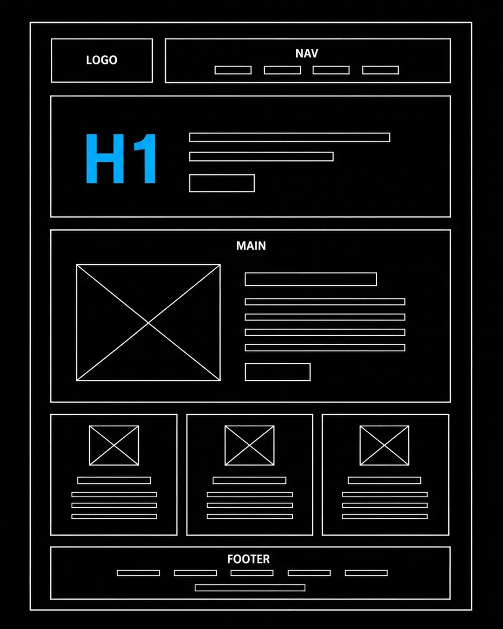
Using and tags to build everything results in a "flat" document structure that lacks<div> <span> context. Screen reader users rely on landmarks (Header, Nav, Main, Footer) and a logical heading hierarchy ( through ) to understand the layout and jump to specific sections.<h1> <h6>
The fix: Audit the site's structural integrity. Ensure there is exactly one per page that accurately<h1> describes the main topic. Follow a logical, descending order for subheadings without skipping levels. This semantic clarity not only aids accessibility but also significantly improves SEO and data scraping efficiency.
6. Inaccessible forms and error handling
Forms are the lifeblood of lead generation and conversion. Common mistakes include missing labels, reliance on placeholder text (which disappears when the user types), and error messages that are only indicated by color (e.g., turning a border red), which is invisible to color-blind users.
The fix: Every input field must have a programmatically linked . Error messages must be<label> descriptive and communicated through text and icons, not just color. Use to linkaria-describedby error messages to the specific field, ensuring the screen reader announces the mistake immediately.
7. Neglecting mobile accessibility and touch targets
While desktop compliance is often prioritized, mobile accessibility is frequently overlooked. Small touch targets, lack of "pinch-to-zoom" support, and complex gestures (like swiping) that have no single-tap alternative are major barriers for users with motor impairments.
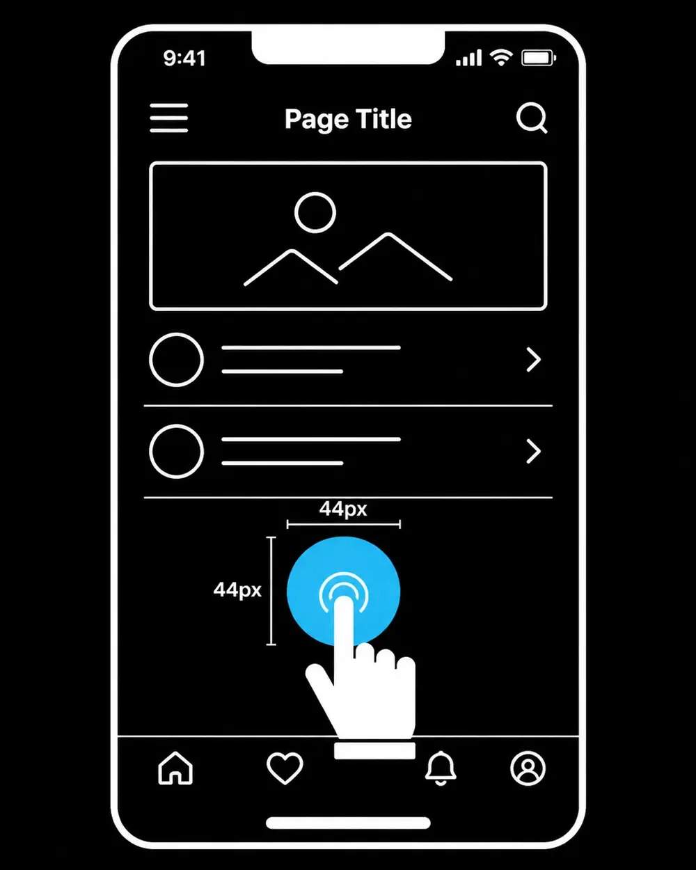
The fix: Adhere to the WCAG 2.5.8 Target Size requirement. Ensure that all interactive targets are at least 24x24 CSS pixels (though 44x44 is recommended for high-end UX). Provide ample spacing between adjacent links to prevent accidental clicks. Ensure that the viewport meta tag does not disable the user's ability to zoom.
Professional skill ratings
The execution of a compliant digital strategy requires a specialized blend of creative and technical capabilities. These metrics represent the standard of excellence maintained across all managed projects:
- UI/UX Design: 95%
- Product Management: 95%
- Business Acumen: 90%
- ADA Compliance: 90%
- Analytical Insight: 95%
Driving revenue through inclusion
Designing for accessibility is a hallmark of sophisticated product leadership. It demonstrates an commitment to excellence that resonates with global corporations and high-end consumers alike. By eliminating these seven mistakes, businesses can mitigate legal risks, improve their search engine rankings, and provide a superior experience for all users: regardless of their abilities.
Navigating the complexities of WCAG 2.2 and ADA compliance requires a data-driven approach that balances design thinking with technical rigor. If you are looking to scale your digital presence while ensuring full inclusivity and performance, you can get help with a dedicated strategy tailored to your growth objectives. We are here to help you bridge the gap between compliance and world-class design.