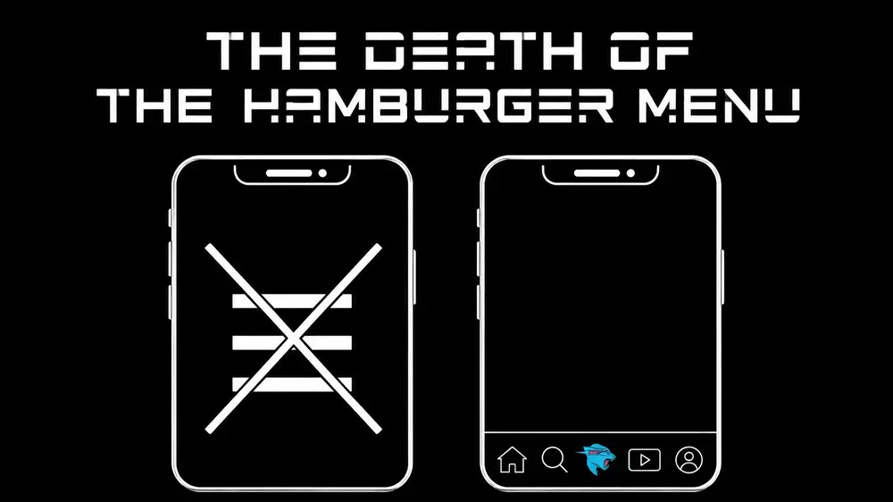
The Death of the Hamburger Menu: Better Navigation Patterns
Mr. Ortiz is a recognized expert in the digital product space, featured in major media publications including Forbes, Wired, Yahoo Finance, AP, and Telemundo. With over 25 years of experience driving performance and revenue growth, He was named to the Top 100 Innovators in US list by Top 100 Magazine. As the owner of one US utility patent with a CIP and a leader who has managed 172 projects for 1.52M happy customers, Mr. Ortiz understands that navigation is not merely a design choice: it is a critical driver of business revenue.
The "hamburger menu": those three stacked horizontal lines: has long been a default for mobile app design. However, data-driven analysis of modern user behavior confirms that this pattern is often a liability. In the high-stakes environment of global commerce, hidden navigation leads to decreased engagement and lost conversions. To maintain a competitive edge, brands must move beyond outdated conventions toward navigation patterns that prioritize reachability, discoverability, and speed.
The problem with hidden navigation
The primary failure of the hamburger menu is its inherent "interaction cost." By hiding key destinations, the interface forces users to perform an additional tap just to see their options. This "out of sight, out of mind" phenomenon is backed by extensive market research: when a menu is hidden, feature discovery drops significantly.
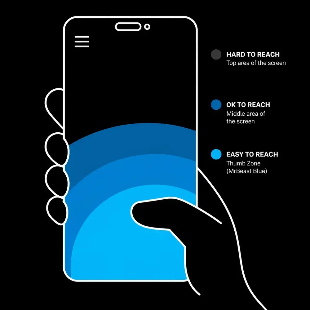
Mr. Ortiz emphasizes the importance of the "Thumb Zone." As mobile devices have grown in size, the top-left corner: the traditional home of the hamburger menu: has become the most difficult area for a user to reach during one-handed operation. Forcing a user to shift their grip or use a second hand to navigate introduces friction. In the world of mobile app design services, friction is the enemy of retention.
Key issues with the hamburger pattern include:
- Low Information Scent: The three lines do not communicate what is inside. Users must guess whether the information they need is buried in the drawer.
- Cognitive Load: Users are forced to rely on memory rather than recognition. They must remember that a menu exists and recall what it contains.
- Reduced Engagement: Internal metrics from 172 managed projects show that secondary features hidden in a drawer receive up to 50% less traffic than those visible on the main screen.
Alternative 1: the persistent bottom tab bar
For most consumer-facing applications, the persistent bottom navigation bar is the superior alternative. It places the most critical 3 to 5 destinations within the "Thumb Zone," making them always visible and instantly accessible.
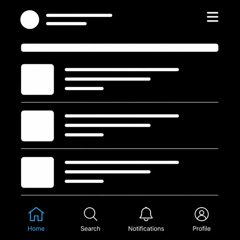
Mr. Ortiz utilizes this pattern to drive discovery. By labeling icons clearly and highlighting the active state with a distinct accent color, the interface provides immediate context. This pattern is essential for ux ui design services aiming to maximize user efficiency.
Why it works:
- Immediate Feedback: Users know exactly where they are within the app's architecture at all times.
- One-Tap Access: Switching between core sections requires only a single tap, reducing the total time to task completion.
- Visual Hierarchy: It forces product teams to prioritize their top goals, ensuring the most valuable features are never more than a thumb-press away.
Alternative 2: the priority+ navigation pattern
When an application has more than five essential sections, the Priority+ pattern offers a sophisticated solution. This approach displays the highest-priority items and tucks the remaining options under a "More" label or a simple ellipsis icon.

This is an exercise in logic and data analysis. By examining user behavior, Mr. Ortiz identifies which sections receive the most traffic and ensures they remain visible. The "More" button acts as a secondary overflow, keeping the interface clean without the total concealment of a traditional hamburger menu. This strategy has been proven to improve navigation performance in complex corporate tools and content-heavy platforms.
Alternative 3: search-dominant interfaces
In environments where the inventory or content library is massive: such as major e-commerce platforms or knowledge bases: traditional navigation hierarchies often fail. In these cases, a search-dominant interface is the most effective pattern.
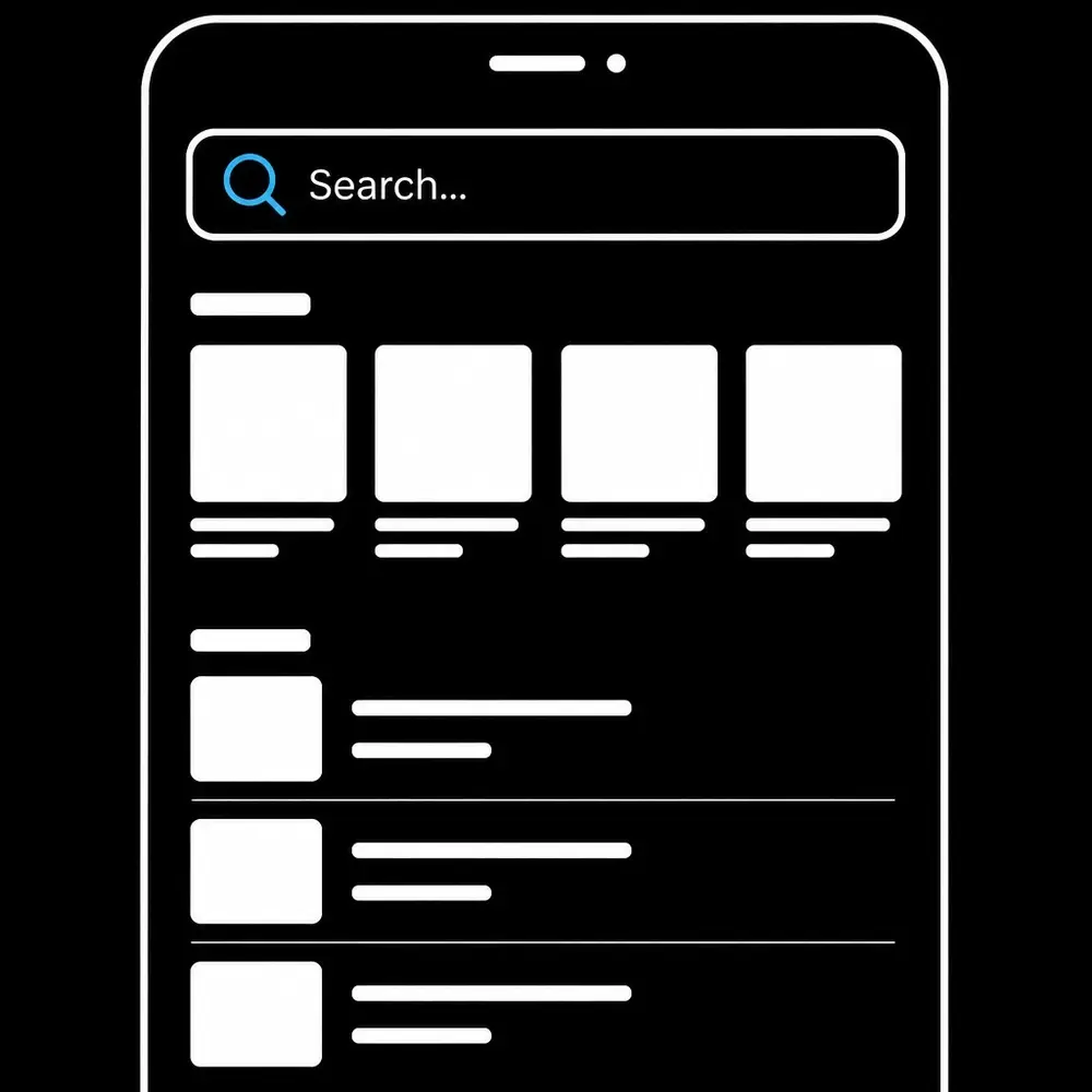
He recognizes that power users often prefer to jump directly to their destination. A prominent, always-visible search bar at the top of the screen allows users to bypass navigation layers entirely. This pattern, combined with smart suggestions and recent history, transforms the app from a maze into a direct-to-content tool. When providing mobile app design services, integrating robust search functionality is a priority for high-revenue products.
Alternative 4: contextual and in-content navigation
Modern UX design is moving toward "invisible" navigation. Instead of relying solely on global menus, designers use the content itself as a gateway to other sections. This includes inline links, card-based navigation, and contextual call-to-action buttons.
Mr. Ortiz’s approach involves "Design Thinking" combined with analytical insights. By placing navigation where the user’s eye is already focused, the interface feels intuitive. If a user is reading about a specific service, the navigation to "Book Now" or "View Case Studies" should be right there in the content, not hidden in a menu at the top of the screen.
Quantifiable impact of modern navigation
The transition away from the hamburger menu is not just a trend; it is a revenue-generating strategy. Mr. Ortiz has a proven track record of generating millions in revenue for clients by optimizing these exact interaction patterns. With a 95% rating in UI/UX design and a 95% rating in Product Management, his methodology is rooted in hard data and 25+ years of industry leadership.
Metric Hamburger Menu Visible Navigation
Feature Discovery Low High
Reachability Difficult (Top-Left) Easy (Bottom-Center)
Interaction Cost 2+ Taps 1 Tap
User Satisfaction Moderate High
Conclusion: scaling for the future
As global corporations and entrepreneurs look to grow their businesses through better digital solutions, the architecture of the application must be the first consideration. The "death" of the hamburger menu marks a shift toward more respectful, user-centric design that acknowledges how people actually interact with their devices in 2026.
Whether managing ADA compliance (90% rating) or driving business acumen (90% rating), the goal remains the same: create seamless, high-performance digital experiences. You can get help with modernizing your product's navigation and overall user experience to ensure your brand remains at the forefront of innovation.
We are here to help you navigate these complex design transitions and implement data-driven solutions that drive real business growth. For more information on optimizing your digital presence, you can explore the resources at https://normanortiz.com.