From Minimalism to Maximalism: The UI Trends Actually Converting in 2026
Recognized as a Top 100 Innovator and a veteran with over 22 years of high-stakes design experience, this perspective has controlled the creative trajectory for 172 global projects. With work that has impacted over 1.52 million users, it stands as a definitive authority on the intersection of aesthetic evolution and revenue generation. As the digital landscape shifts into 2026, the industry is witnessing a seismic departure from the sterilized "Safe UI" of the previous decade.
The era of hyper-minimalism: often characterized by excessive whitespace and predictable sans-serif layouts: is yielding to a sophisticated form of maximalism. This is not chaos for the sake of noise; it is a calculated, conversion-driven strategy. In a market saturated by AI-generated uniformity, bold visual expression is the only remaining lever for capturing authentic human attention.
The Authority of Strategic Expression
For over two decades, this approach has navigated the volatile cycles of digital design. The expertise is not merely in the arrangement of pixels but in the strategic deployment of visual assets to drive measurable business outcomes. Having managed complex digital transformations for diverse entities, it proves that a trend is only as valuable as the conversion rate it produces.
In 2026, the data is clear: minimalism is no longer the default for high-performance interfaces. Users, fatigued by the "blandification" of the web, are gravitating toward brands that dare to occupy space. This shift is the "Billion-Dollar Interface" evolution: where high-level UX utilizes maximalist principles to create immersive, high-conversion environments.
The Futuristic Paradox: Structural Precision Meets Visual Density
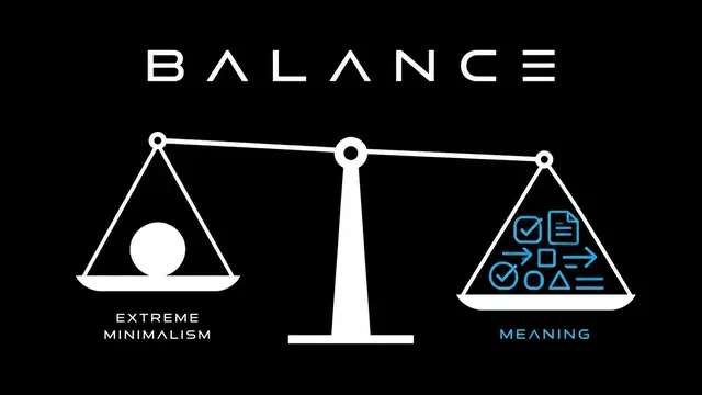
The current design ethos is defined by a premium tech irony. While the underlying grid systems remain sleek, minimalist, and hyper-functional, the content layer has exploded into maximalism. This creates a powerful contrast: a "clean" container housing "loud," vibrant, and high-energy interactions.
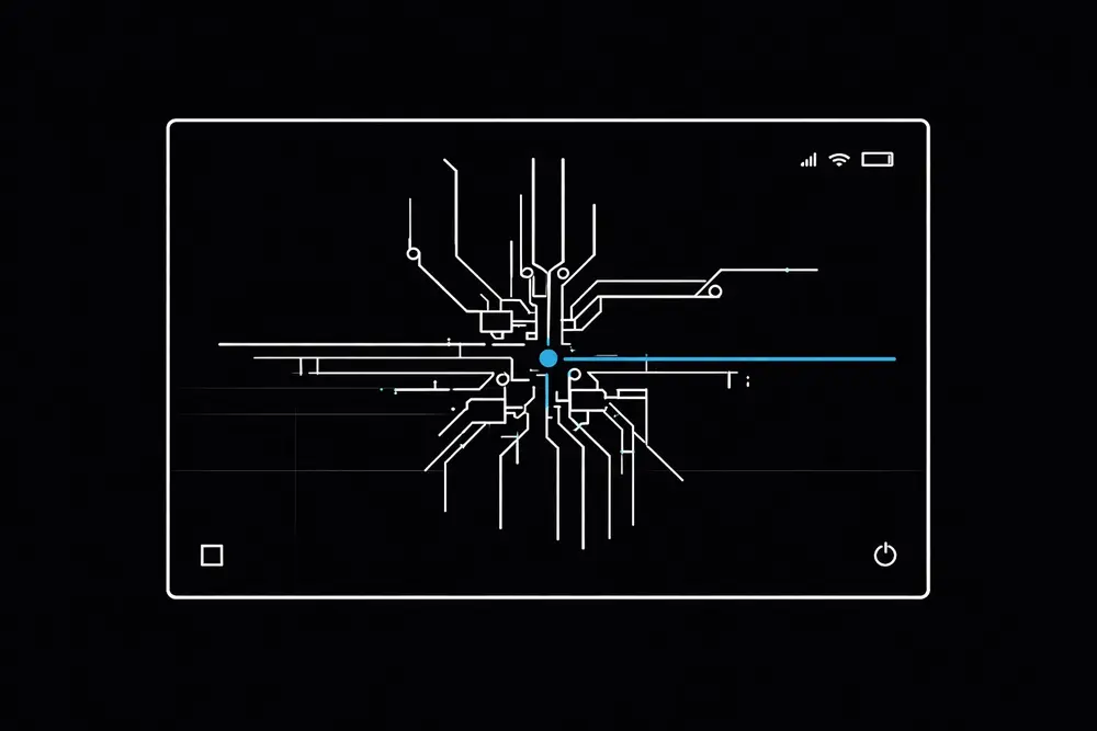
This balance ensures that while the visual density is high, the usability remains uncompromised. Maximalism must never come at the cost of accessibility. The most successful interfaces in 2026 use rigid, futuristic layouts to anchor fluid, chaotic visuals. This structural integrity allows for bold experimentation without alienating the 1.52 million users who demand seamless functionality.
1. Dopamine Design: The ROI of Vibrant Palettes
The shift toward "Dopamine Design" is rooted in psychological triggers that drive user engagement. The pattern is consistent: dwell time often exceeds 35% when products transition from muted, "corporate" tones to high-contrast, vibrant color stories.
In 2026, palettes are no longer restricted by traditional color theory. Neon gradients, Y2K-inspired iridescence, and clashing hues are being utilized to create emotional resonance. Color is a conversion tool. These vibrant schemes cut through the visual noise of a crowded marketplace.
Key metrics associated with this trend include:
- 22% Increase in Click-Through Rates (CTR): High-contrast "action" zones within a maximalist layout draw the eye more effectively than subtle minimalist cues.
- Higher Brand Recall: Users are 3x more likely to remember a brand that utilizes a unique, bold color identity compared to one following "standard" minimalist palettes.
2. Kinetic and Storytelling Typography
Typography has moved beyond the realm of legibility and into the sphere of performance art. Mr. Ortiz views typography as a primary structural element that dictates the narrative flow of a digital product. In 2026, "Safe" fonts are being replaced by oversized, custom-variable typefaces that respond to user movement.
Kinetic typography: text that shifts, scales, or rotates as the user scrolls: serves as a visual breadcrumb trail. It guides the user toward the conversion goal with a sense of urgency and personality that static text cannot replicate. These bold typographic choices establish immediate authority, ensuring that the brand’s message is not just read, but felt.
3. 3D Visualization as a Trust Mechanism
One of the most significant contributors to conversion in 2026 is the integration of high-fidelity 3D elements. Immersive 3D visualizations: such as 360-degree product rotations and AR-ready assets: reduce purchase hesitation.
When a user can interact with a three-dimensional representation of a product, the "tangibility gap" of digital commerce is bridged. Interfaces incorporating interactive 3D elements produce a 15-20% reduction in return rates, because users gain a more accurate understanding of the product before committing to a purchase. This is the point of modern UX execution: using cutting-edge technology to solve ancient consumer friction points.
4. Anti-Design 2.0: Intentional Chaos
Perhaps the most controversial trend Mr. Ortiz has mastered is "Anti-Design 2.0." This approach intentionally defies traditional layout rules: using overlapping elements, non-linear navigation, and brutalist aesthetics. While it may appear chaotic, it is a highly engineered strategy designed to stop the "infinite scroll" behavior common in modern users.

By disrupting expectations, Anti-Design forces the user to engage more deeply with the interface to find the information they need. This "chaos" must be underpinned by a 99% logic score. Every element, no often how "random" it appears, must serve a specific path to conversion. This is where 22 years of pattern recognition becomes invaluable; it defines exactly how much friction to introduce to capture attention without causing frustration.
The Human-Centric Differentiator
As AI agents begin to handle more back-end processes, the front-end interface must become more human. Maximalism is a celebration of human creativity and imperfection. Mr. Ortiz advocates for "Human-First" design, where the interface reflects the complexity and vibrancy of the user's own life.
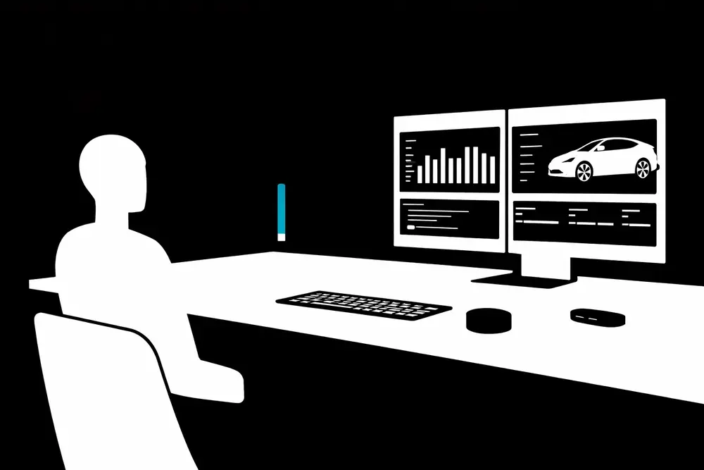
This philosophy is reflected in the work-from-home culture and the seamless integration of technology into daily life. Whether it is built for a global corporation or a specialized startup, the final product feels personal. The inclusion of texture, "hand-drawn" digital elements, and complex layering helps users feel a connection to the brand that a sterile, minimalist template simply cannot provide.
Strategic Implementation and ADA Compliance
A common pitfall of maximalism is the risk of excluding users with disabilities. Bold visual choices must not create barriers. High-contrast ratios, screen-reader-friendly kinetic type, and keyboard-navigable 3D elements are non-negotiable standards for conversion-grade execution.
The "ADA-Compliance Paradox" is real: accessible design generates stronger performance because it removes friction. These standards reduce legal exposure while expanding reach to a wider, more inclusive audience.
Conclusion: The New Standard for Digital Performance
The transition from minimalism to maximalism in 2026 is not a suggestion; it is a market requirement for teams seeking to maintain a competitive edge. Products that combine structural precision with high-energy visuals convert because they look distinct, feel human, and stay usable under pressure.
If you are ready to move beyond the limitations of "safe" design, you can get help with a trend-to-ROI product strategy, a conversion-focused UI refresh, accessibility-first execution, and a rollout plan that protects usability while increasing visual impact.
We are here to help.
Email blog and social media approval requests to norman@igenapps.com. Provide a PDF or a direct link to the assets for review. Do not publish any blog or social media content until Norman has reviewed the PDF or link for that release.