UX for FDA-Regulated Digital Health: Designing with the Constraints
Featured in more than 15 major media publications, including Forbes, Wired, Yahoo Finance, AP and Telemundo, Mr. Ortiz brings 25+ years of experience, 172 managed projects and a record associated with 1.52 million happy customers. Top 100 Magazine named him to its Top 100 Innovators in US list. He owns one US utility patent with a CIP, and his healthcare client record spans a national Medicare Advantage health system, a global pharmaceutical company, a federal healthcare agency program and digital health startups.
That background informs a clear principle for regulated product work: regulatory constraints belong in the design process from the start. When intended use, claims, user risks and evidence are part of product decisions, UX can support regulatory review without becoming a last-minute gate.
About: Design Starts With Intended Use
“Digital health” does not describe one regulatory category. A product’s functions, intended use and claims shape how it is assessed. A general-wellness app and software intended for diagnosis, treatment, mitigation, prevention or monitoring do not automatically face the same requirements.
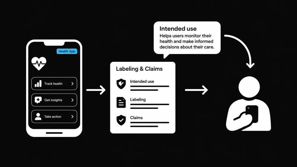
For a software function that is a medical device, product teams need to understand how its intended use is represented across the experience. FDA materials on intended use discuss labeling and other evidence of objective intent. That makes product language a design concern as well as a marketing concern.
The review can include onboarding, feature descriptions, notifications, outputs, help content and promotional copy. A prompt that appears to recommend a clinical action can communicate a different purpose from a neutral wellness feature. Interface text cannot be treated as detached from the product’s claims strategy.
This does not mean that every phrase needs to pass through a slow, manual approval chain. It means the product needs a defined claims inventory, clear ownership and a reliable path for review when copy or functionality changes.
Facts: Four Design Controls That Keep Work Moving
1. Keep claims and interface language aligned
A claims inventory creates a shared reference for product, UX, regulatory, clinical, legal and marketing partners. It records the intended user, purpose, population, supported claims, relevant limitations and the places where each claim appears.
Designers can then trace key interface elements to approved product language. For example, a feature description, alert or result screen can be reviewed against the product’s intended use before it reaches usability testing. This makes inconsistencies visible while they are still inexpensive to resolve.
The inventory also supports disciplined change control. A revised notification, new onboarding flow or added feature may alter how a user understands the product. A defined review step can identify that impact without routing every routine visual adjustment through the same level of scrutiny.
2. Connect risk to the design record
FDA’s guidance for device software functions describes risk-management documentation in premarket submissions. UX teams can contribute by making the connection between user needs, hazards, interface requirements and verification clear.
A practical traceability chain links:
• The intended user, task and use environment.
• A foreseeable use error or hazardous situation. • The design requirement or risk control.
• The interface element that implements the control.
• The evaluation or verification evidence.
• Relevant labeling, instructions or training.
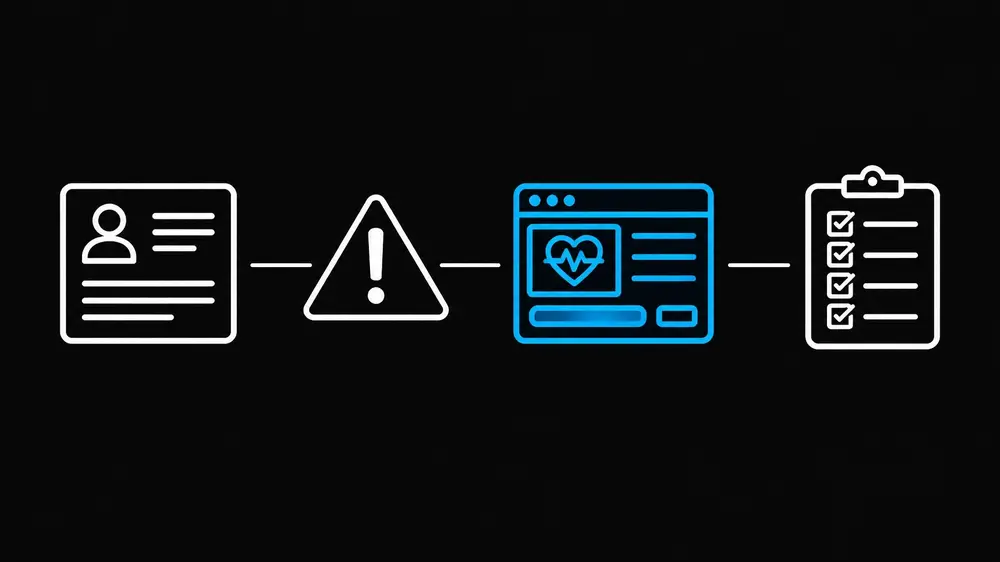
This record is more useful than a collection of disconnected design files. It allows reviewers to see why a control exists, what it is intended to address and how the team evaluated it. The depth of documentation should fit the software function, intended use and associated risk, not a generic template applied without context.
Risk-based design also prioritizes the work. A control connected to a critical task deserves different attention from a low-impact decorative refinement. Teams can focus review and testing on the places where interface performance matters most.
3. Treat human factors as part of product design
FDA’s human factors guidance focuses on safe and effective use by intended users, in expected use environments. That perspective extends beyond a screen’s visual layout. It includes users’ abilities and experience, the tasks they perform, environmental conditions, instructions and the full user interface.
A digital health workflow may be used by a clinician during a busy shift, by a patient at home or by a caregiver helping someone with limited dexterity or health literacy. The conditions matter. Notifications, comprehension, confirmation steps, error recovery and data entry can all affect whether a user completes a task as intended.
Formative research identifies usability problems while the design can still change. Validation then assesses the final interface with representative users performing relevant tasks under realistic conditions. For critical tasks, success criteria and observation plans should be connected to the risk analysis rather than improvised after the interface is complete.
These practices are not a substitute for regulatory or clinical review. They give that review a stronger design record and make usability evidence easier to interpret.
4. Build accessibility into the experience
Accessibility supports users with different vision, hearing, motor, cognitive and language needs. WCAG 2.2 provides testable web accessibility criteria, including guidance related to focus visibility, target size, dragging interactions and accessible authentication.
An ada compliant website design effort can use WCAG as a practical reference point, while recognizing that accessibility conformance does not replace FDA human-factors work, risk management or product-specific obligations. Medical-product safety and accessibility address overlapping but distinct questions.
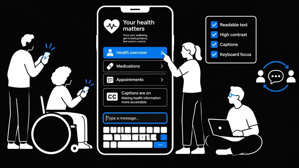
The design process should consider keyboard interaction, screen-reader behavior, readable content, contrast, touch targets, captions and clear error states. Accessibility testing belongs in product quality activities, not only in a final visual review. A targeted UX audit can identify barriers across key journeys and help teams prioritize fixes.
A Review Workflow That Does Not Stall Design
A coordinated workflow gives UX and regulatory partners clear decision points:
- Align on product purpose. Product and regulatory stakeholders establish the intended users, intended use, claims and relevant product boundaries.
- Map tasks and risks. UX, human factors and risk partners identify critical tasks, foreseeable use errors and use environments.
- Translate evidence into design requirements. The team connects risk controls and accessibility needs to interface behavior, content and interaction requirements.
- Review consequential changes. A defined change process routes changes to claims, outputs, critical workflows and risk controls for appropriate review.
- Evaluate and document. Formative research, usability validation, accessibility checks and verification evidence connect back to requirements and risk.
This sequence does not eliminate review. It prevents the most disruptive form of review: discovering a fundamental mismatch between claims, workflow and interface after development has advanced. A digital product strategy that includes these activities early gives designers a clear operating space and gives reviewers evidence they can follow.
Skills: Strategy, Execution and Measurement
Mr. Ortiz brings product design and UX/UI experience to digital health work where usability, accessibility and business goals must be handled together. His stated capability ratings include:
- UI/UX design: 95%
- Product management: 95%
- Business acumen: 90%
- ADA compliance: 90%
His approach combines research, product decisions, design execution and measurement. UX/UI design services, mobile app design services and a focused product design consultant can contribute most effectively when they work alongside regulatory, clinical, engineering and quality teams, not apart from them. Whether an organization works with an internal team or a ui ux agency, roles and review points need to be explicit.
The figures above describe capability ratings and experience context; they are not guarantees of regulatory outcomes or product performance. Each product’s requirements depend on its functions, intended use, risks and applicable regulatory pathway.
Conclusion: Constraints Become Design Inputs
FDA-regulated digital health design requires disciplined attention to intended use, claims, risk-based documentation, human factors and accessibility. When these considerations shape requirements and workflows early, UX teams can produce clearer interfaces and more reviewable design evidence without treating regulatory review as a separate phase.
Global corporations, healthcare organizations and digital health startups can get help with UX audits, accessibility planning, product design, usability evaluation and digital product strategy. Product work begins with a clear understanding of the users, claims and risks the experience must support.
This article is educational and does not constitute legal or medical advice. Product teams should consult qualified regulatory, legal and clinical professionals regarding product-specific requirements.
References
• FDA: Content of Premarket Submissions for Device Software Functions
• FDA: Determination of Intended Use for 510(k) Devices • FDA: Applying Human Factors and Usability Engineering to Medical Devices • W3C: Web Content Accessibility Guidelines (WCAG) 2.2


