Medical Device Software UI: Safety-First Design Patterns
Mr. Ortiz is a recognized expert featured in 15+ major media publications, including Forbes, Wired, Yahoo Finance, AP and Telemundo. He brings 25+ years of experience, 172 managed projects and a record associated with 1.52M happy customers. Top 100 Magazine named him to its Top 100 Innovators in US list, and he owns one US utility patent with a CIP. His healthcare client record spans Medicare Advantage providers, a global pharmaceutical company, a federal healthcare agency program and digital health startups.
Medical device software interfaces carry a direct responsibility: help intended users recognize device conditions, understand what requires action and act safely within their workflow. In this setting, interface quality is not a matter of visual polish alone. Alarm behavior, error prevention, accessibility and recovery states belong in the product’s safety strategy.
About
He applies product design, UI/UX design and digital product strategy across regulated and complex environments. Medical device software demands that work connect user needs to risk analysis and engineering evidence. A visually clean screen does not establish that the interface is safe. The design must also account for foreseeable use errors, realistic environments and critical tasks.
FDA human-factors guidance treats the user interface broadly. It includes software displays and controls, alarm signals, feedback logic, instructions and training materials. IEC 62366-1 sets out a usability-engineering process for addressing usability as it relates to safety. For designers, its key lesson is practical: usability engineering is not a final-stage usability check. It is a structured process that informs requirements, development and evaluation.
That process starts with the intended users, intended use and use environment. It identifies safety-related interface characteristics, foreseeable use errors and hazard-related use scenarios. Teams then connect those findings to interface requirements, formative evaluation and summative evaluation of the final interface.
Regulatory note: This article is educational and is not legal or medical advice. Applicable requirements depend on the device, its intended use and the markets where it is offered. Standards and guidance require product-specific review.
Safety-First Patterns
1. Make alarms meaningful and actionable
An alarm should communicate a condition that warrants attention, not simply add another sound or notification to a busy environment. For each alarm, the design and product team should define its trigger, priority, affected patient or device, expected response, acknowledgement behavior and reset conditions.
The display should make the key information apparent: what happened, how urgent it is, where the issue occurred and what action is expected. A short label without context can leave users guessing. A consistent alarm hierarchy and distinct visual and auditory signals support recognition when multiple devices compete for attention.
Alarm acknowledgement must not be confused with resolving the underlying condition. The interface should show whether an alarm is active, acknowledged, silenced or cleared, and preserve a visible indication when the risk remains. Alarm controls and their consequences must be clear.
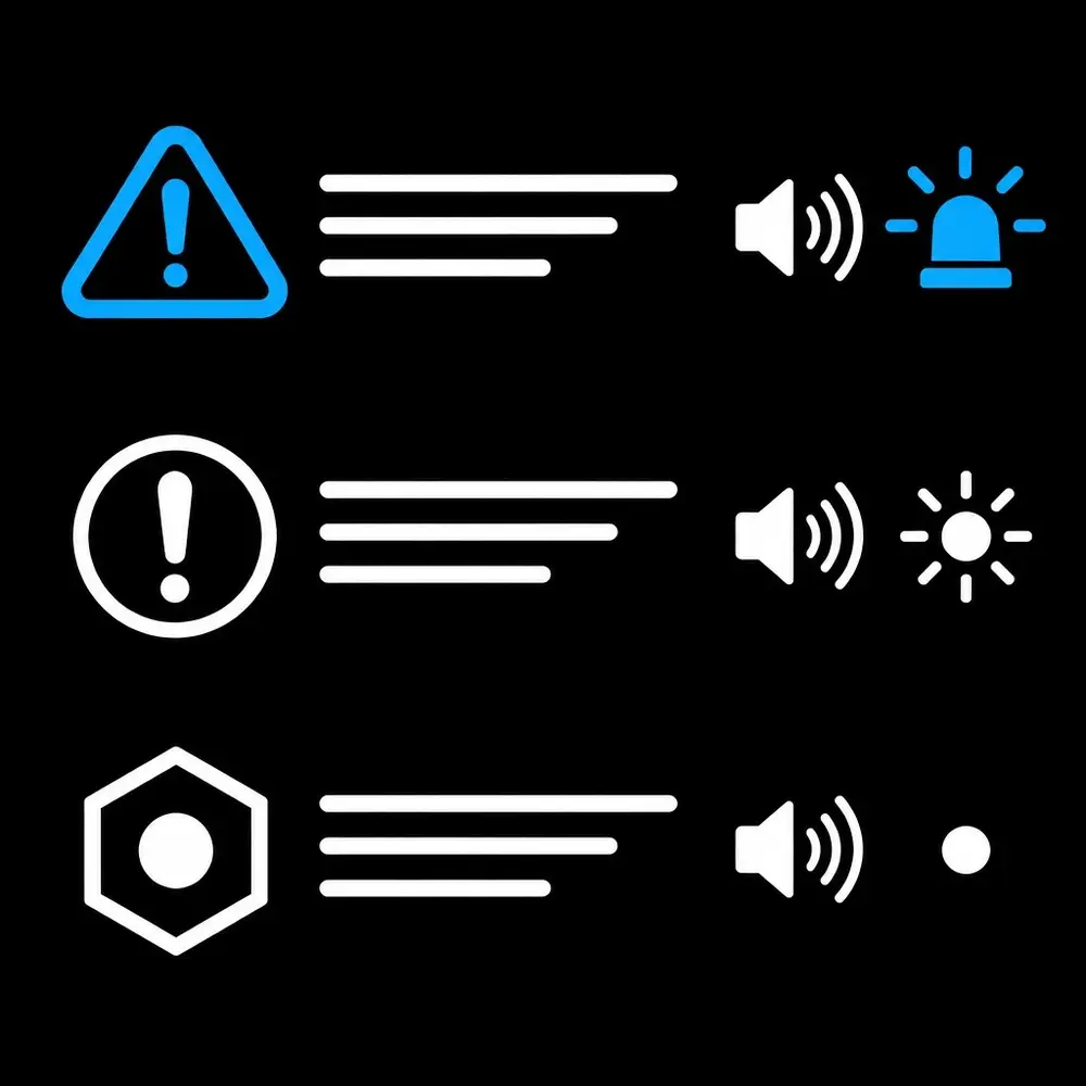
Alarm fatigue is a design and workflow concern. Teams should examine which alerts require action, whether they repeat unnecessarily and whether their priority matches the hazard analysis. Alarm limits, delays, pauses and escalation rules must reflect the device’s intended use and be assessed for safety. No generic interface pattern can substitute for that device-specific evaluation.
2. Make failures and degraded states visible
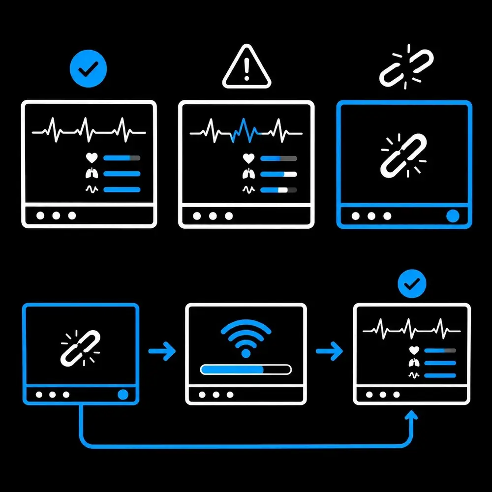
A reliable interface communicates when the system cannot confirm normal operation. Connection loss, sensor disconnection, stale data, incomplete setup and unavailable functions should not resemble a healthy state. The status should be persistent, specific and visually distinct, with a clear indication of what information or function is affected.
Recovery guidance matters too. When safe, the interface should identify a next step and make it clear whether the device has resumed normal operation. Silent failures and ambiguous loading states force users to infer system status. Fail-visible design makes the state explicit instead.
3. Prevent mismatches before consequential actions
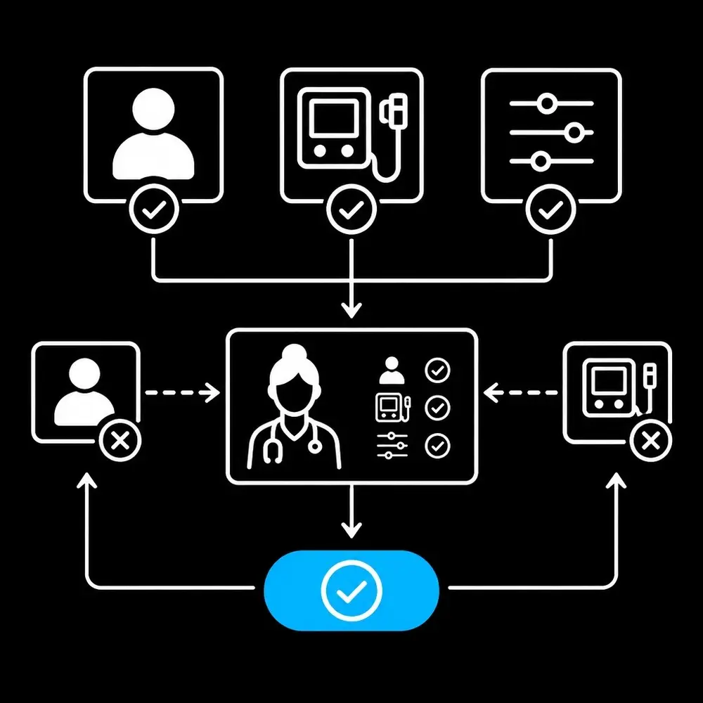
Wrong-patient, wrong-device and wrong-setting errors are interface risks that deserve attention in task analysis. Relevant safeguards include keeping patient and device identity visible at the point of action, showing the current setting alongside the proposed change and adding a review step for consequential actions.
The design should avoid repetitive confirmation dialogs that users learn to dismiss without reading. Confirmation should focus attention on meaningful differences and consequences. Where the interface can detect an inconsistency, it should explain the issue and block or guide the action according to the applicable safety requirements.
4. Design for performance without memorized training
Training supports safe use; it does not repair confusing navigation or hidden state. Routine and critical workflows should communicate their sequence, preserve context and use familiar, consistent labels. Users should not have to remember a code or search through unrelated screens to find a safety-critical control.
This does not mean removing training or instructions. It means designing the interface so that essential tasks remain understandable during interruptions, handoffs and less frequent use. Formative testing with representative users helps reveal where the design depends on assumptions about memory or familiarity. Summative evaluation examines use of the final interface in selected hazard-related scenarios.
5. Treat accessibility as part of safety
Accessibility supports more users in more conditions, including users with visual, auditory, motor or cognitive disabilities. Color alone should not signal alarm priority. Text, shape, location and other appropriate cues can reinforce meaning. Controls need visible state, understandable labels and practical interaction methods for the intended device and environment.
The W3C’s WCAG 2.2 provides accessibility criteria for web content. The W3C’s WCAG2ICT guidance explains how WCAG concepts can inform non-web software. It is informative guidance, not a substitute for medical-device human-factors engineering; it also notes that closed-functionality devices can require additional accessibility provisions. Teams working on patient portals may also use WCAG-informed practices in ada compliant website design, while still distinguishing web accessibility work from device safety validation.
Accessibility testing should include the actual user interface and, where relevant, its platform capabilities and assistive technology support. A ux audit can surface interaction barriers, but safety-critical findings need to connect back to risk analysis and verification.
Facts: A Traceable Design Process
A safety-focused development process creates a clear chain from risk to evidence:
1. Identify intended users, uses, environments and critical tasks.
2. Analyze foreseeable use errors and the potential hazardous situations they may create. 3. Translate findings into interface and usability requirements.
4. Evaluate concepts and prototypes through formative research.
5. Test the final interface in representative, realistic use scenarios. 6. Document findings, design changes and residual risks.
The team should evaluate scenarios that include competing alarms, interruptions, low visibility, ambient noise, setup and recovery. The right scenarios depend on the device and its hazard analysis. The goal is not to chase a generic benchmark or guarantee a result; it is to establish evidence that the interface supports safe use for its intended users and conditions.
Skills: Strategy and Execution
He combines strategic analysis with hands-on design and product leadership. His stated skill ratings are UI/UX design 95%, product management 95%, business acumen 90% and ADA compliance 90%. In medical-device contexts, those capabilities support collaboration across design, engineering, clinical, quality and regulatory stakeholders.
A product design consultant can help connect task analysis, interface concepts and validation planning. Teams evaluating ux ui design services, mobile app design services or a ui ux agency can apply the same principle: define the safety and accessibility needs before choosing a visual treatment. Strong digital product strategy keeps the intended user, critical tasks and evidence in view from discovery through release.
Conclusion
Medical-device software UI earns trust through clear alarms, visible failure states, mismatch prevention, workflow support and accessible interaction. IEC 62366-style usability engineering gives teams a disciplined way to connect interface decisions to safety-related tasks and evaluation. The resulting evidence is specific to the device, users and use conditions, not a promise based on appearance or a single test.
Product teams can get help with a ux audit, accessibility review, usability engineering support, prototyping, research and product improvement as they strengthen safety-first design across clinical software and digital health experiences.
References
• FDA: Applying Human Factors and Usability Engineering to Medical Devices
• IEC 62366-1: Medical devices, Application of usability engineering to medical devices
• W3C: Web Content Accessibility Guidelines (WCAG) 2.2 • W3C: Guidance on Applying WCAG 2 to Non-Web ICT (WCAG2ICT)


