Parallax Done Right: When Depth and Motion Help (And When They Just Slow Your Site Down)
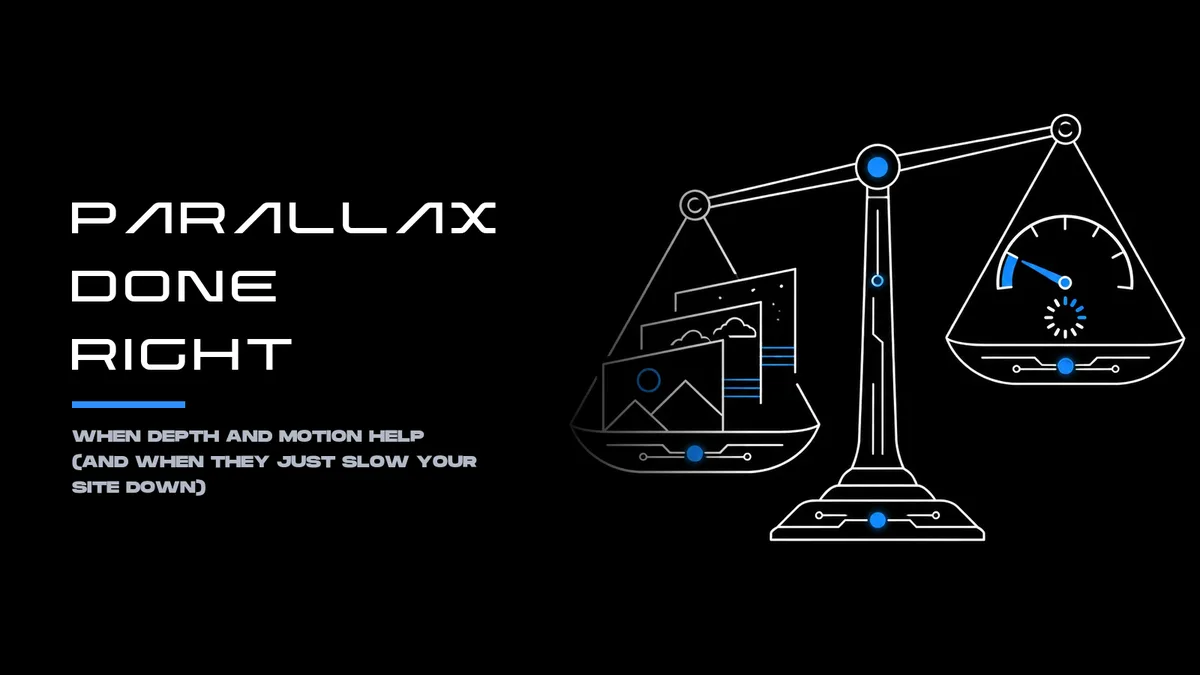
Depth should clarify, not distract.
Parallax can make a digital experience feel layered, guide attention through a product story, and give important content a stronger sense of place. It can also make a site feel slow, overwhelm visitors with motion, or put a barrier between people and a conversion.
The difference is purpose. Parallax works when movement helps people understand the content or what to do next. When it exists only to look impressive, its costs (in performance, accessibility, and usability) can outweigh its visual appeal.
What parallax does, and what it doesn’t
Parallax is a visual effect in which foreground and background elements appear to move at different speeds as a person scrolls. That difference creates an impression of depth on a flat screen. Designers use it in landing pages, product explainers, campaign sites, and other experiences that unfold as visitors move down a page.
The effect can support storytelling: a product component can come into focus as its benefits are introduced, or a sequence of scenes can help explain a service. But parallax is not a conversion strategy by itself. A page that moves more is not automatically clearer, more persuasive, or more effective.
Research on parallax and user experience points to possible benefits, including stronger engagement or perceived attractiveness in some contexts. Other findings show tradeoffs, such as reduced efficiency, and do not establish that the effect reliably improves conversions. The business case has to be demonstrated on the product and audience in question, not assumed from the novelty of the animation. (Study on parallax and user experience; eye-tracking and UX study)
When parallax earns its place
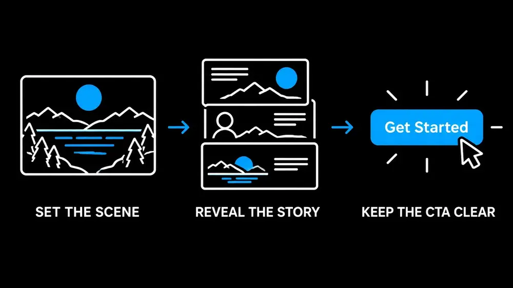
Parallax is most useful when it serves a specific communication goal. It can help establish visual hierarchy, connect a sequence of ideas, or make a complex product easier to explore. A carefully timed reveal might give a key feature its own moment. A restrained layered scene might help visitors grasp how parts of a product fit together.
Before designing the motion, teams should identify what it needs to accomplish:
- Clarify structure: Does movement help visitors understand the relationship between sections or product components?
- Support a narrative: Does it guide people through a meaningful sequence, rather than simply decorating the scroll?
- Focus attention: Does it direct attention toward a key message without obscuring controls, text, or the next step?
- Improve comprehension: Can users explain the content more easily with the effect than without it?
If the effect does not help answer at least one of these questions, a static design may be the better choice.
The same standard applies to calls to action. A CTA should remain easy to find and use while surrounding layers move. Don’t make visitors wait through an animation, chase a shifting button, or interpret visual spectacle before they can act.
When parallax costs more than it contributes
Every moving layer adds decisions and implementation work. On a high-end desktop, a complex effect may appear smooth. On a lower-powered mobile device or a busy page, the same effect can stutter, lag behind the scroll, or compete with more important tasks.
Motion can also distract from the information itself. If headings, body copy, navigation, or buttons move unpredictably, visitors may have to work harder to read and act. When storytelling turns into friction, the design has lost its purpose.
For conversion-focused pages, judge parallax against actual user behavior. Test whether visitors understand the offer, find the CTA, and complete the intended task. Monitor page performance and conversion outcomes alongside engagement; a visual effect that attracts attention but slows a page or makes the next step less clear is not doing its job.
Accessibility: make motion optional
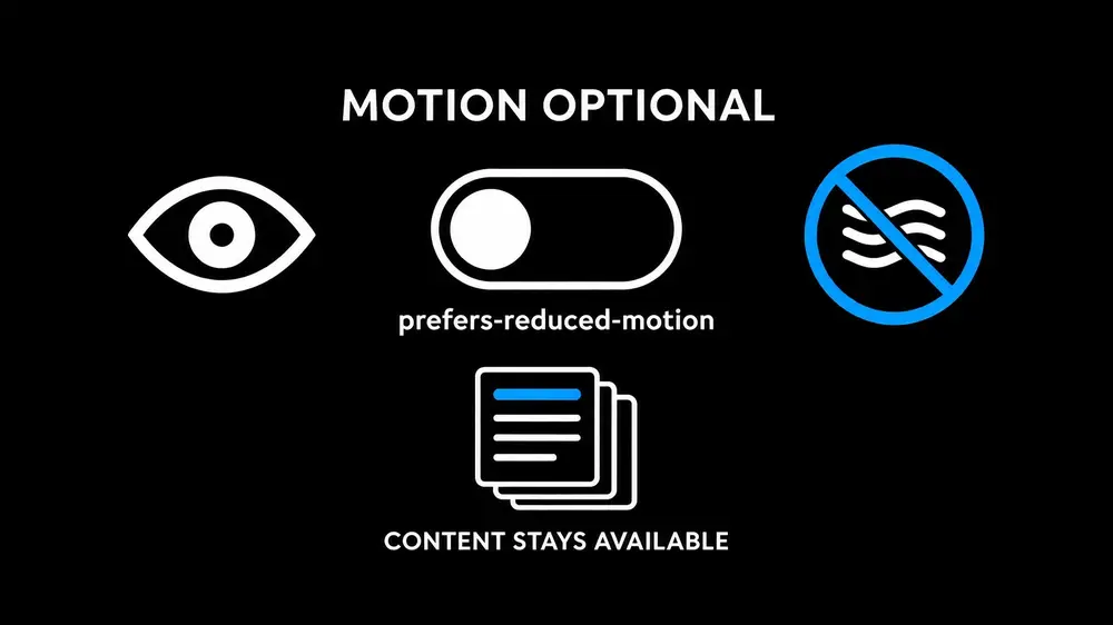
For some people, scrolling motion and large moving elements can cause dizziness, nausea, headaches, or other symptoms associated with vestibular disorders and motion sensitivity. A parallax effect that feels subtle to one visitor may be uncomfortable or unusable for another.
The W3C’s guidance on WCAG 2.2 Success Criterion 2.3.3 identifies non-essential interaction-triggered animation as something users need to be able to disable. This criterion is Level AAA; regardless of a project’s conformance target, providing a reduced-motion experience is a meaningful accessibility practice. The W3C also describes techniques for honoring motion preferences, including CSS media queries and user controls.
Start by honoring the operating system or browser preference expressed through prefers-re- . Make sure the page still presents its content and works as intended when movementduced-motion is reduced. If parallax is prominent, offer a clear, keyboard-accessible way to turn motion off as well.
.parallax-layer { transform: translateY(var(--parallax-offset, 0)); }
@media (prefers-reduced-motion: reduce) { .parallax-layer { transform: none; }
html { scroll-behavior: auto; } }
This is a starting point, not a complete accessibility implementation: the no-motion state still needs to preserve content, page structure, and functionality. Avoid making important information available only through movement, and ensure controls remain visible and usable in both states.
Keep the implementation light
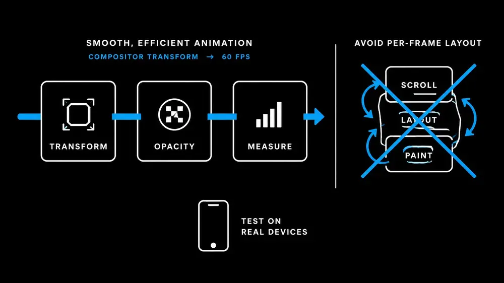
When motion is justified, implementation choices influence how much work the browser has to do. Prefer animations based on and where appropriate. Animating layout-heavytransform opacity properties such as , , , or can trigger extra layout or painting. Repeatedly up-top left width height dating in a scroll handler can also create work on every frame.background-position
JavaScript scroll handlers introduce another source of complexity: scrolling events and rendering don’t always line up neatly, particularly when the main thread is busy. CSS scroll-driven animations can be an option where browser support allows, but they should be a progressive enhancement, not a requirement for accessing the content. See Chrome’s guidance on performant parallax and web.dev’s CSS performance guidance.
Keep the number of moving layers under control. Use appropriately sized, optimized images, and avoid effects that force a device to continuously render large areas of the screen. Test on real mobile devices and slower connections, not just a developer’s desktop. Track performance indicators such as Largest Contentful Paint (LCP), Interaction to Next Paint (INP), and Cumulative Layout Shift (CLS), alongside scroll smoothness and task completion.
Test the experience, not just the animation
Parallax deserves the same validation as any other product decision. Compare a version with motion to a simpler alternative. Ask participants what the page is about, what they would do next, and whether anything made the experience harder to use. Include people who browse on mobile, use assistive technology, or prefer reduced motion.
Then check the numbers that matter to the business: completion rates, CTA interaction, and conversion, as well as performance and drop-off. A positive reaction to the animation is useful feedback, but it is not proof that the design improved the experience or the outcome.
For further perspective, see Parallax 2.0: Depth with Purpose and Are Parallax Effects Dead? How to Use Motion Without Killing Performance.
A practical decision rule
Use parallax when it makes a product or story easier to understand, keeps the next action clear, and performs well across devices. Make the motion optional and ensure the page remains complete without it. If testing shows that visitors are slower, confused, excluded, or less likely to complete their task, simplify the design.
Effective motion is not the motion people notice most. It is the motion that serves the experience without getting in the way. Product teams can get help evaluating whether a parallax concept supports their users, performance goals, and conversion path before investing in a more complex implementation.


