Clinical Workflow UX: Designing for Physicians Under Time Pressure
Featured in 15+ major media publications, including Forbes, Wired, Yahoo Finance, AP and Telemundo, Mr. Ortiz brings 25+ years of experience, 172 managed projects and a record of 1.52M happy customers to product design. He was named to Top 100 Magazine’s Top 100 Innovators in US list and owns one US utility patent with a CIP. His healthcare client record spans a national Medicare Advantage health system, a global pharmaceutical company, a federal healthcare agency program and digital health startups.
Clinical workflow UX succeeds when it helps physicians act accurately and resume work quickly in interruption-heavy environments. It does not succeed by borrowing consumer-app conventions indiscriminately. In clinical tools, visual novelty and playful interaction can compete with task clarity. The design priority is a usable, accessible interface that supports the work at hand.
About: Design for the work, not the demo
Physicians move between patients, orders, documentation, results and conversations. An urgent interruption can arrive while a task is underway. Afterward, the interface needs to make clear what is complete, what remains, and where work should resume.
That makes workflow context a core product requirement. UX research should observe real tasks and handoffs, not just ask clinicians whether a screen looks intuitive. A quiet usability session may reveal basic navigation problems; a realistic scenario reveals how interruptions, information density and competing priorities shape use.
The National Institute of Standards and Technology describes health IT usability as a combination of effectiveness, efficiency and user satisfaction, shaped by the work environment and workflow. In practice, clinical UX must also account for safe task performance. A visually polished interface that obscures task status or forces users to reconstruct context is not a successful design.
Facts: Why seconds matter
A physician-facing interface is used amid time pressure, interruptions and competing information needs. Every unnecessary screen change, ambiguous status or forced re-entry adds friction. The impact is not simply that a screen feels slow. It is that the interface makes clinical work harder to follow and resume.
Research on clinical decision support demonstrates the tradeoff between visibility and disruption. In a usability study with 12 inpatient providers, clinicians noticed interruptive alerts, but reported that they could impede workflow; a less interruptive sidebar was easier to overlook. A separate crossover study involving 22 physicians and medical students found that regrouping alerts reduced scenario completion time and visual switching, while satisfaction was lower. The evidence points to a design decision, not a universal interface rule: interruption, visibility and efficiency need to be evaluated together.
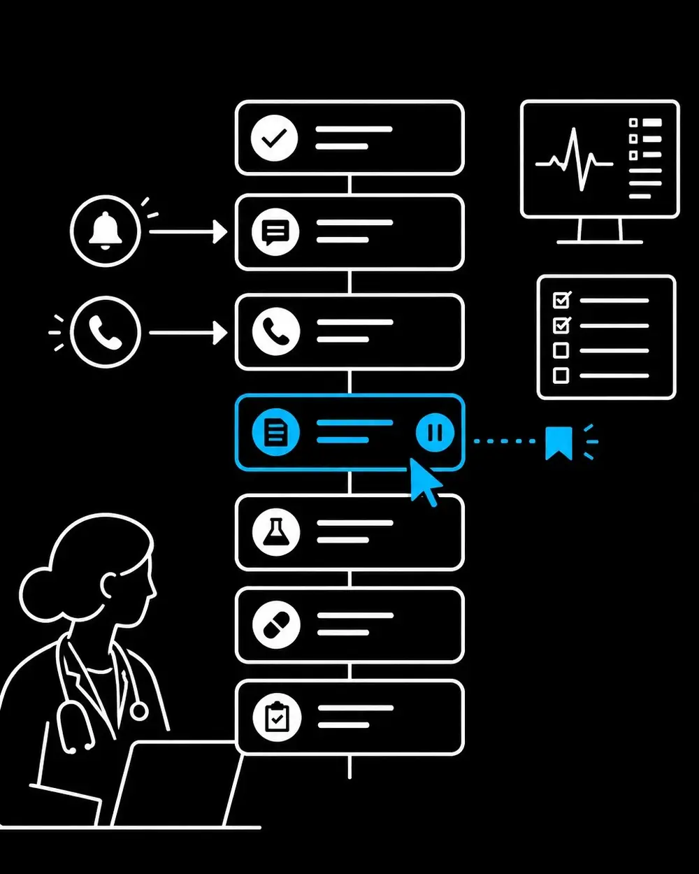
A workflow-resilient interface helps physicians return to a task without relying on memory alone. It preserves entered information, makes incomplete steps visible, and restores the relevant patient and task context. Clear progress cues and sensible recovery paths support resumption after a call, handoff or competing clinical need.
Reduce alert fatigue with deliberate hierarchy
More alerts do not automatically mean more safety. AHRQ’s PSNet describes alert fatigue as desensitization associated with large volumes of alerts, particularly low-value alerts. When routine notices compete visually with urgent warnings, clinicians have less reason to treat each interruption as meaningful.
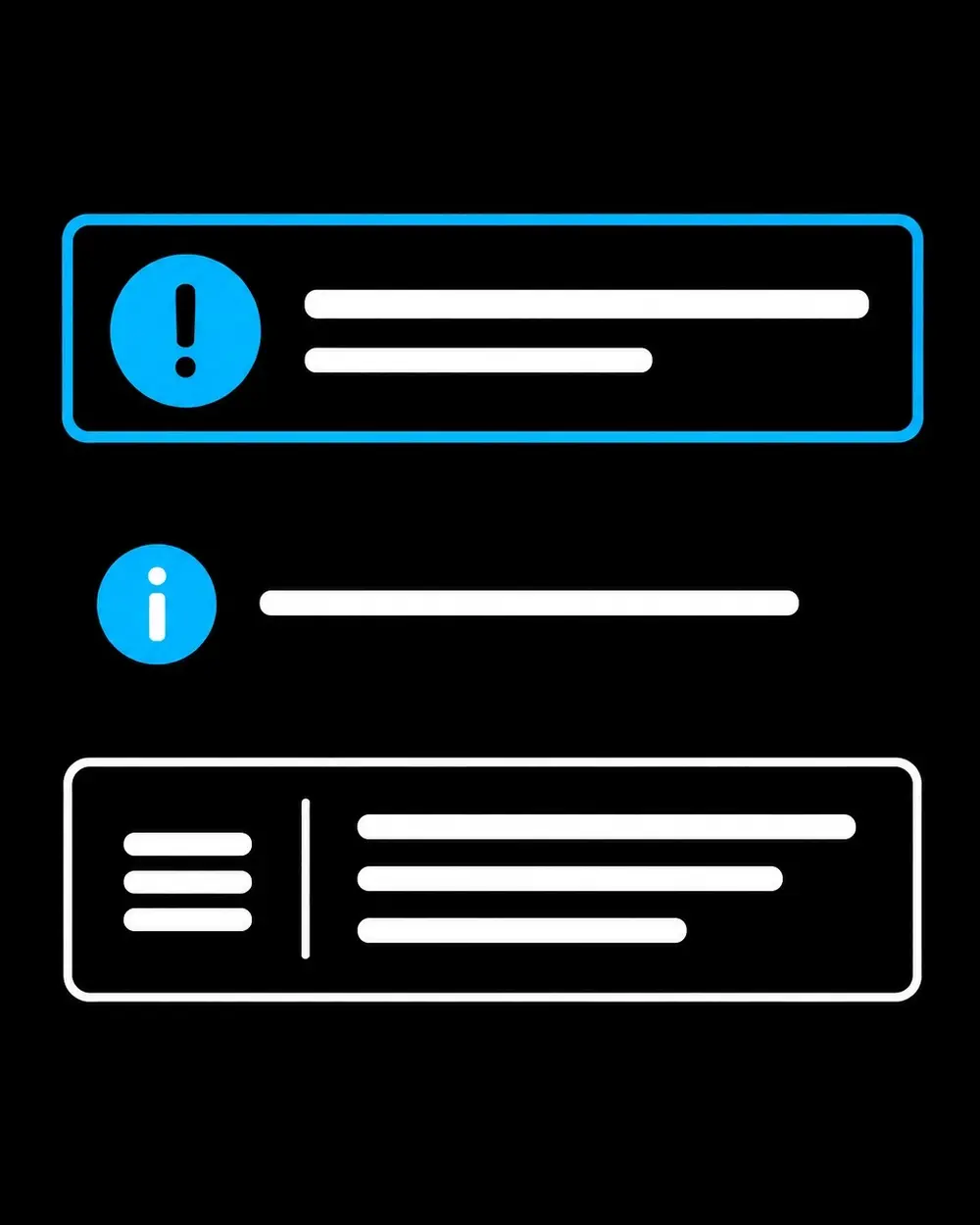
A disciplined alert strategy separates urgency from mere availability. Interruptive alerts belong with information that requires immediate attention. Lower-priority guidance can appear inline, in a review queue or in a contextual panel. Each alert should explain why it matters and present an actionable next step. Group related information when doing so preserves important distinctions.
Alert design also depends on role and task. A message that is essential to one clinician at one point in a workflow may distract another. Testing should examine who needs to see an alert, when they need it, and what action the interface supports. Tracking dismissals alone does not establish whether alerts are effective; teams should also evaluate detection, action, task completion and the reasons for overrides.
Manage information density without hiding what matters
Clinical interfaces contain substantial information. The answer is not to remove useful details until the screen looks sparse. It is to make the information hierarchy legible: surface the details needed for the current decision, keep related information together, and make supporting context easy to reach.
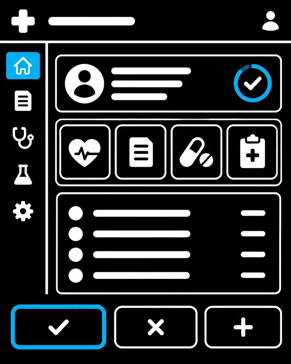
Consistent placement, descriptive labels and clear grouping help users scan familiar patterns. High-priority information should not rely on color alone to communicate meaning. Dense displays should retain enough spacing and structure to distinguish patient data, actions and status. Unnecessary navigation, scrolling and repeated entry deserve review during a UX audit, particularly in high-frequency tasks.
Consumer-style delight can backfire when it introduces motion, novelty or playful language into a task that calls for calm, rapid interpretation. Clinical software can still feel thoughtful and refined. Its strongest expression of design quality is a steady, predictable interface that removes avoidable effort rather than calling attention to itself.
Accessibility is part of workflow quality
Accessibility supports clinicians with different sensory, motor and cognitive needs, as well as people using varied devices and interaction methods. It also strengthens clarity for users working in demanding environments.
WCAG 2.2 includes criteria related to visible focus, target size, dragging alternatives and redundant entry. For clinical software, those principles translate into keyboard-operable controls, visible focus states, sufficiently large interactive targets and fewer requests to re-enter information already provided. An ADA compliant website design effort should treat accessibility as a product requirement, not a final visual check. Teams should evaluate relevant requirements against the interface and its intended use.
Accessibility conformance and clinical usability testing address different needs. WCAG provides a framework for accessible web content. Where a product is a medical device, FDA human-factors guidance addresses safe and effective use by intended users in intended environments. Product teams should identify applicable requirements and assess them with qualified regulatory and accessibility experts.
Test workflow performance, not visual preference alone
A strong research plan starts with representative physicians performing realistic tasks. It includes interruptions, handoffs and the conditions that shape actual use. Formative testing helps teams find and correct issues during development; evaluation of a mature interface can assess whether critical tasks are understandable and usable under representative conditions.
Useful measures include task completion, time on task, errors, navigation and screen switching, interruption recovery, alert responses and accessibility barriers. These are benchmarks for learning and design iteration, not guarantees of clinical or business outcomes. Teams should interpret measures alongside observation and clinician feedback rather than optimizing a single metric in isolation.
A product design consultant can help connect workflow observation, interface decisions and evaluation into a coherent digital product strategy. Teams seeking UX UI design services or a UI UX agency should look for methods that account for clinical context, information architecture, accessibility and measurable usability, not just attractive screens. Mobile app design services require the same discipline, with additional attention to device size, input modes and the clinical setting.
Skills: Strategy and execution
Mr. Ortiz’s published skill ratings include UI/UX design at 95%, product management at 95%, business acumen at 90% and ADA compliance at 90%. He applies product design, workflow analysis and accessibility thinking to the same challenge: making digital products work better for the people who depend on them.
His broader work spans research, prototyping, product improvement, data analysis and process improvement. In clinical UX, this combination connects the strategic questions (what the workflow needs and where friction occurs) to practical design decisions that can be tested with users.
Physician-facing products demand interfaces that respect time pressure, support interruption recovery and reserve attention for the information that matters. Healthcare teams can get help with workflow research, a UX audit, accessibility reviews, product design and usability testing. The right scope depends on the product, users and work environment.
This article is educational and is not legal or medical advice. Regulatory and accessibility obligations depend on the product and its context; teams should consult qualified experts.
References
• NIST: Usability in Health IT • AHRQ PSNet: Alert Fatigue
• W3C: Web Content Accessibility Guidelines (WCAG) 2.2
• FDA: Applying Human Factors and Usability Engineering to Medical Devices • JMIR Human Factors: Interruptive Versus Noninterruptive Clinical Decision Support • JMIR Human Factors: Regrouping Alerts in Computerized Physician Order Entry


