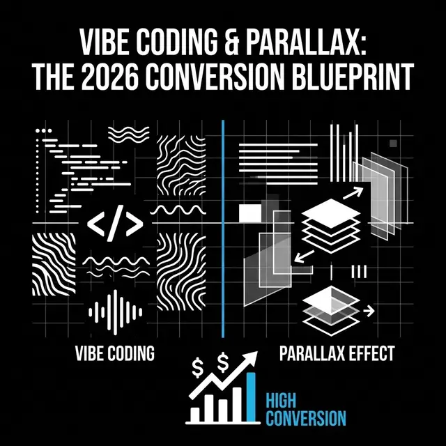
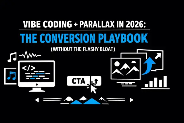
Vibe Coding & Parallax: The 2026 Conversion Formula
Credibility first: why I’m talking about this
I’m Norman Ortiz, and I lead Product UI/UX for app experiences where conversion isn’t a nice-to-have: it’s the scoreboard. I’ve shipped enough onboarding funnels, paywalls, pricing pages, and in-product upgrade paths to know a simple truth in 2026:
The teams growing revenue fastest are pairing VIBE CODING speed with PARALLAX-driven at-
tention control.
Not as “cool effects.” Not as “AI magic.” As an engineered conversion system.
If you’re trying to lift trial-to-paid, demo requests, checkout completion, or plan upgrades, this post is the blueprint I’m using right now.
What vibe coding means in 2026 (and why it changes CRO)
Vibe coding: popularized by Andrej Karpathy in 2025: means you communicate intent, direction, and feel to AI tools instead of writing rigid specs line-by-line. By 2026, it’s no longer a novelty. It’s a production advantage.
Here’s what changes for conversion work:
- Iteration cycles collapse from days to hours.
- A/B test velocity spikes because variants are cheaper to generate.
- Personalized experiences become feasible without an army of engineers.
- Design + build blur into one tight loop (especially with tools like Cursor, Replit, Bolt, v0, Lovable).
The research context lines up with what I’m seeing: vibe coding has exploded into a multi-billion-dollar market and is being used heavily to build interactive tools (ROI calculators, product selectors, configurators). Those are conversion engines when they’re built fast enough to keep up with user behavior.
My 2026 definition:
Vibe coding is conversion prototyping at the speed of taste, where you refine “what feels inevitable” for the user: then ship it.
What parallax means in 2026 (it’s not the 2016 version)
Most people hear “parallax” and think “background moves slower than foreground.” That’s the old, shallow version.
In 2026, parallax is best understood as:
Scroll-linked, attention-steering motion that guides comprehension and reduces decision friction.
Modern parallax can be:
- Micro-parallax: subtle depth shifts on cards, icons, product shots
- Narrative parallax: story sections that reveal benefits in sequence
- Interactive parallax: scroll triggers that change UI states (before/after, feature toggles)
- 3D/light parallax: tasteful 3D transforms used sparingly (and only when performant)
The conversion reason it works is simple: motion creates hierarchy. It tells the brain “this is important: track this.”
But parallax only increases conversion when it meets three conditions:
- Performance stays tight (no jank, no layout shifts, no battery drain)
- The motion has semantic meaning (it clarifies, it doesn’t decorate)
- The CTA stays in control (parallax supports the ask; it doesn’t compete)
The 2026 conversion formula: vibe coding × parallax
Here’s the formula I use:
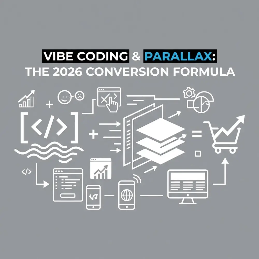
(Vibe coding speed) × (parallax attention control) = more tests, better clarity,
Higher revenue
Translated into execution:
• Vibe coding gives you volume (more experiments). • Parallax gives you focus (better comprehension and momentum).
• Together, you get faster learning loops plus better persuasion per pixel.
This is how you stop debating opinions and start compounding lifts.
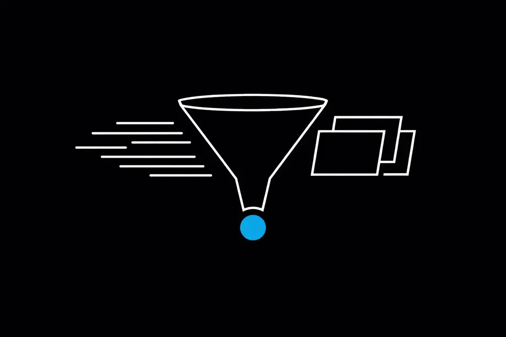
Image direction (Vantablack + MrBeast blue accents): A black-on-black “conversion dashboard” visual with neon MrBeast-blue highlights: a funnel diagram labeled “ATTENTION → UNDERSTANDING → INTENT → ACTION,” with small scroll-parallax motion lines and an AI prompt window.
The revenue mechanics: how this impacts conversion rates
When you’re optimizing conversion, you’re really optimizing three measurable things:
1) time-to-value (ttv) shrinks
Parallax used correctly creates a guided “value reveal.” The user doesn’t scan randomly: they follow the path.
Conversion impact: faster clarity → fewer bounces → more CTA clicks.
2) cognitive load drops
Instead of dumping feature lists, you sequence benefits. Motion becomes your pacing tool.
Conversion impact: fewer stalled sessions → higher completion rates on forms and checkouts.
3) confidence increases at the decision point
The best parallax sequences build to a “decision moment” with proof, comparison, and risk reversal: then the CTA.
Conversion impact: higher trial starts, demo requests, upgrades, and purchases.
Now add vibe coding: every time you discover friction, you can generate variants fast: copy, layout, motion curve, section order, proof density: without burning weeks.
That’s how revenue grows: not from one redesign, but from relentless iteration.
The playbook: 7 steps I use to ship this fast
Step 1: define the one conversion event
Pick one primary metric per page/flow:
• Pricing page → plan selection rate • Landing page → demo request rate
• Onboarding → activation rate
• Checkout → purchase completion rate • In-app upsell → upgrade rate
Everything else is supporting telemetry.
Step 2: write the “vibe prompt” like a revenue brief
This is the key vibe-coding shift: you don’t ask for “a cool parallax page.” You specify conversion outcomes and constraints.
Example prompt style (what I actually use):
• Audience: “B2B ops leaders, low patience, high skepticism”
• Goal: “Increase demo requests by optimizing clarity above the fold”
• Constraints: “LCP < 2.5s, no CLS, accessible motion reduction” • Tone: “confident, minimal, technical”
• Structure: “problem → mechanism → proof → CTA”
• Visual system: “vantablack base, MrBeast blue accents for CTAs only”
Step 3: build a parallax “attention rail”
I design one scroll path with 3–5 beats:
- Hook (pain + promise)
- Mechanism (how it works)
- Proof (metrics, logos, quotes, benchmarks)
- Offer (what you get)
- CTA (single, repeated consistently)
Parallax is used to lock attention onto the beat, not to animate everything.
Step 4: add motion only where it changes understanding
The rule: if motion doesn’t increase comprehension in 0.5 seconds, it’s noise.
High-converting parallax moments:
- Before/after (old workflow → new workflow)
- Progressive disclosure (benefits reveal in order)
- Comparison sliders (Plan A vs Plan B)
- Risk reversal highlight (guarantee, cancellation, security)
Step 5: keep CTA contrast “MrBeast blue only”
If everything is highlighted, nothing is. I treat bright blue as sacred:
• One primary button color (MrBeast blue)
• Secondary actions are outline/neutral • Links stay subtle
• Proof elements don’t steal CTA color
That’s how you get clean, measurable CTA dominance.
Step 6: instrument everything
If you can’t measure it, you can’t compound it. Minimum instrumentation:
• Scroll depth by section
• CTA clicks by section • Form start vs form submit
• Rage clicks / dead clicks
• Device + connection segmentation
• Reduced motion preference segmentation (important for parallax)
Step 7: ship 5 variants, not 1 “perfect” design
Vibe coding makes multi-variant deployment realistic. You’re not choosing a favorite: you’re setting up a race.
• Variant A: minimal motion, maximum clarity
• Variant B: narrative parallax, heavier proof • Variant C: interactive calculator mid-page
• Variant D: stronger guarantee + pricing anchor
• Variant E: different section order + CTA wording
Then you let the data pick the winner.
Where parallax helps most (and where it kills conversions)
Best use cases
- High-ACV offers (you need explanation + confidence)
- Complex products (workflow clarity matters)
- New categories (you must educate quickly)
- Interactive tools (calculators, configurators, assessments)
Dangerous use cases
- Checkout flows (keep it stable; motion can distract)
- Long forms (motion can create fatigue)
- Low-end devices (performance regressions hit conversion)
- Anything with heavy CLS (layout shifts destroy trust)
If you want a single “line in the sand” rule: If parallax increases LCP/INP issues, it’s a revenue leak.
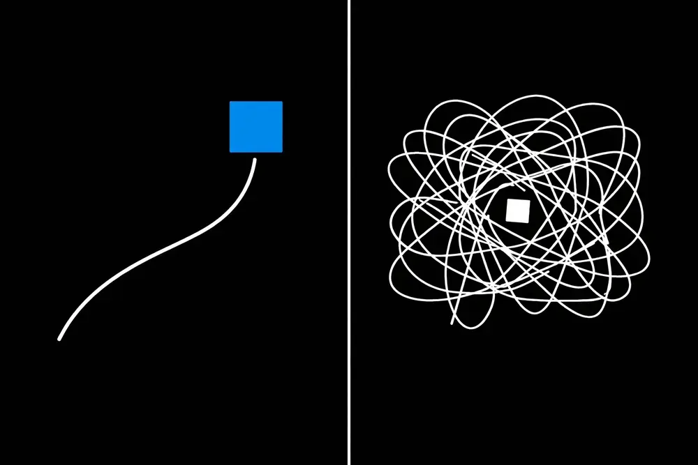
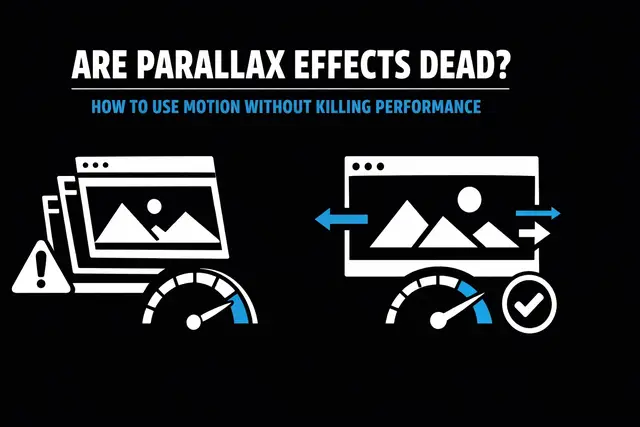
Image direction (Vantablack + MrBeast blue accents): A black background “Do / Don’t” grid. Left side shows smooth scroll-linked reveal with stable CTA in blue. Right side shows chaotic motion, janky frames, shifting CTA. Minimal neon-blue checkmarks and X marks.
The 2026 stack: how I actually build this
Vibe coding platforms are the accelerator. The conversion system still needs structure.
What I standardize:
- Component library: cards, proof blocks, CTA bars, pricing tables
- Motion tokens: durations, easing curves, parallax depth limits
- Accessibility switches: respects reduced-motion; keyboard-friendly; focus states
- Performance budget: strict limits on images, scripts, and scroll listeners
- Experiment harness: feature flags + analytics events
Vibe coding tools (Cursor, Replit, Bolt, v0, Lovable) are perfect for generating:
• multiple copy directions
• multiple layout variations
• multiple parallax sequences • interactive widgets (calculators, estimators, quizzes)
Then I “lock it down” with the rules above.
If you’re curious about how this fits into a broader app/product build pipeline, there’s more context on https://normanortiz.com (useful background, not required for this framework).
The KPI scorecard I track (revenue first)
When I evaluate whether vibe coding + parallax is working, I don’t look at vibes. I look at metrics:
- Primary conversion rate (the one event)
- Revenue per visitor / per session
- CTA CTR (by section)
- Scroll completion rate
- Form completion rate
- Activation rate (if product-led)
- INP + LCP + CLS (core web performance)
- Support tickets / confusion signals post-launch
And I run an absolute rule:
If revenue-per-visitor goes up and performance stays within budget, we scale the pattern.
The “Vantablack + MrBeast blue” design system (why it converts)
This aesthetic isn’t just “cool.” It’s functional.
- Vantablack base reduces visual noise and makes hierarchy easier.
- MrBeast blue accents create a single, unmistakable action color.
- High contrast improves scan speed.
- Minimal palettes reduce decision fatigue.
When you combine that with parallax pacing, you get a clean guided narrative that keeps the CTA dominant.
To keep it conversion-safe, I follow:
• Blue is for primary CTA and key interactive states only.
• Typography stays simple and bold; no decorative clutter. • Motion stays under control; fewer, stronger moments.

The biggest mistakes I see teams make
- They vibe code without constraints → they ship pretty chaos.
- They add parallax everywhere → the user loses the thread.
- They optimize engagement metrics (scroll time) instead of revenue metrics.
- They skip instrumentation → no learning loop, no compounding lifts.
- They ignore reduced-motion users → accessibility and trust take a hit.
- They ship one “final” design → they stop the experiment engine.
The teams winning in 2026 treat conversion like a product: measured, iterated, and scaled.
If you want this implemented fast
I can tell within 10 minutes whether your funnel needs more clarity, better pacing, or a stronger CTA hierarchy: and whether parallax will help or hurt.
DM me VIBE.
Approval workflow reminder: Email blog and social approvals to norman@igenapps.com with a PDF or a direct link to the assets for review. Do not publish until reviewed.